Limited counter top space doesn’t always mean your displays will have less impact. It just means you need to think more creatively and strategically, choosing counter top display solutions that help your space work harder for you.
We asked WBC’s retail development team to give us 3 simple tricks you can start using in your displays to create a bigger impact.
If You Can’t Build Out, Build Up
Building 'up' can help you take a small countertop footprint and maximise it.
Vertical displays are not only eye-catching, but they take a limited counter space and optimise your display opportunity and capacity.
Whether it’s a tiered retail countertop display fixture, a pedestal cake stand or a riser, it's easy to build vertical displays that allow you to increase the ranges you’re able to offer without compromising space.
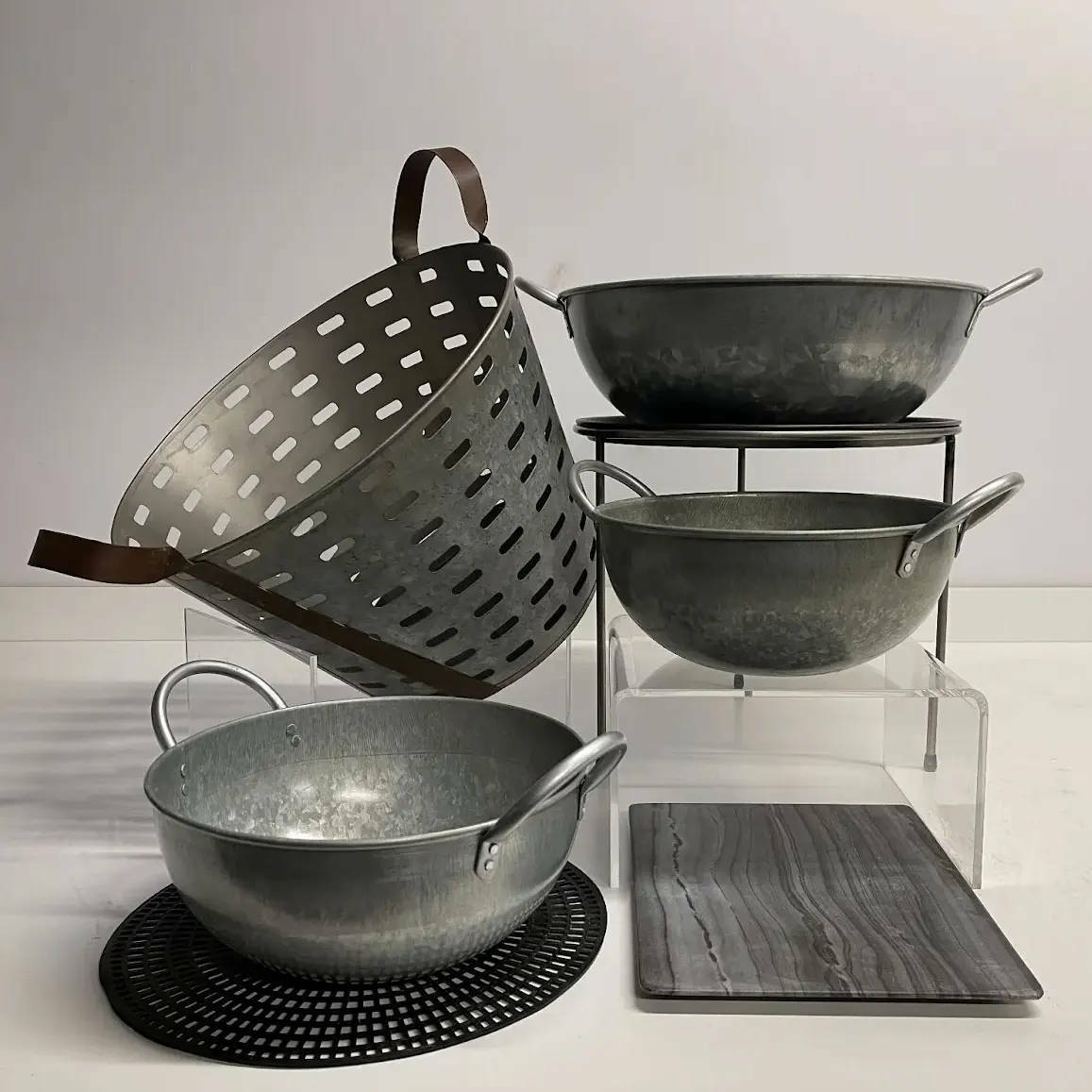
Below, our merchandiser has used a few simple products from our collection of countertop display: acrylic and Matlock risers and an array of galvanised bowls and buckets to illustrate how the smallest metre by metre² surface area, can increase merchandising space, simply by building up.
Once merchandised with product, your space becomes almost architecturally alluring.
Here’s another example.
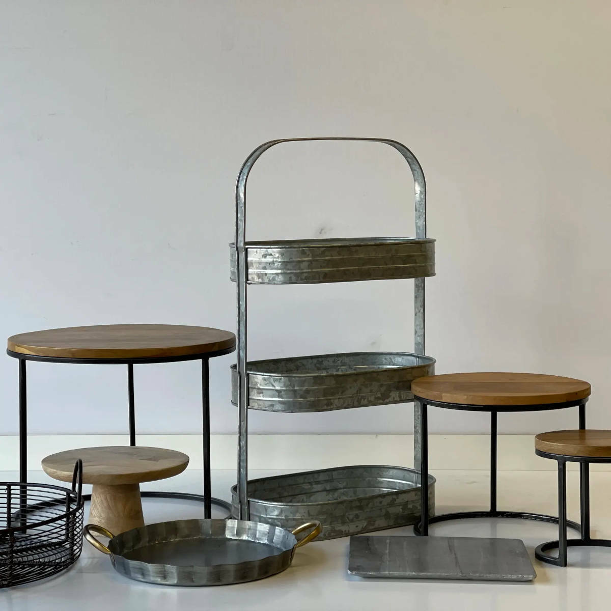
We’ve used a 3 tiered vertical display stand from our collection of wholesale pedestals and risers which when filled, can hold an additional 3-9 products depending on how they’re merchandised.
On either side of this stand, we have chosen to use supportive risers and cake stands too. This gives you additional opportunities to display both on top of them and below, doubling your surface potential.
Arrange in product groups
Arranging products in groups or themes helps customers shop more effectively, but actually helps you save on space too.
This technique, known as “product bundling”, is an age-old sales and marketing trick often used in promotional pieces but is just as useful when you’re short on countertop space
A good example of how grouping products can be effective can be found by visiting a cheese counter to see how it’s really done.
Not only are cheeses generally grouped by variety but also the condiments that accompany them are generally positioned close by. This isn’t by accident.
This grouping gives the customer exactly what they are hoping to find, all within a relatively limited space.
An easy way to product bundle can be by theme or season. Think about seasonal events throughout the year too, like pancake day for example.
If you need some inspiration as you put together your promotional plan, take a look at our UK Food And Drink Marketing Calendar that lists them all.
Improve your signage
Telling your story, creating enticing menus and sharing product information, all require space.
Far too often in a limited space capacity, this part of the retail experience is lost. There are many solutions that help you tell the story without infringing on your limited countertop space.
Using cleverly placed store signage and ticketing can offer you a vast array of options for communication.
Easels
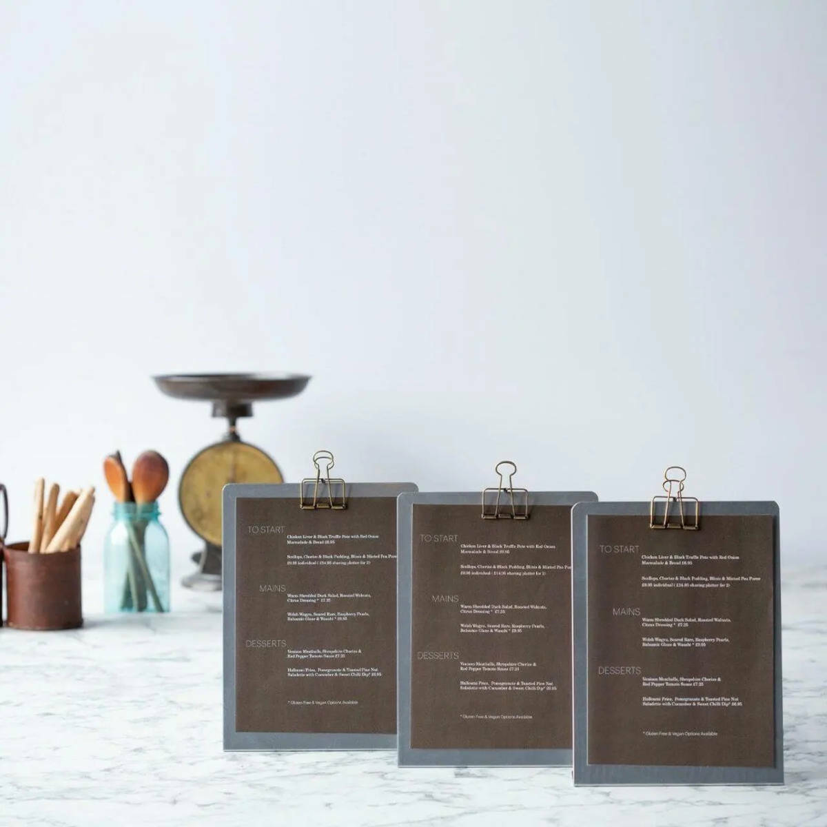
L-shaped display easels are a simple and effective way to create a consolidated list of your offering.
They can be used to communicate information about a selection of items like preserves and chutneys for example, or your list of bakery goods - almost a menu but not just of food, but for ambient lines of product too. One easel can tell the story of many products.
A-frames
Floors are not always considered useful places for signage, but they absolutely can be.
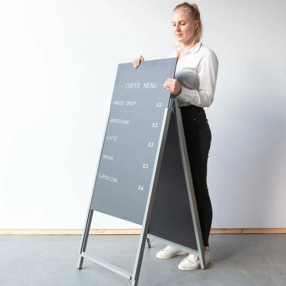
Simple floor standing A-frame boards positioned near a display can either be used to showcase product provenance or simply for pricing.
A great example of how this concept is used can be often found at many local farmers' markets. What are commonly small space capacities with just a simple trestle table set up to sell on, it’s the floor signage that does the job of communicating, keeping your countertop free for product display.
Wall signage
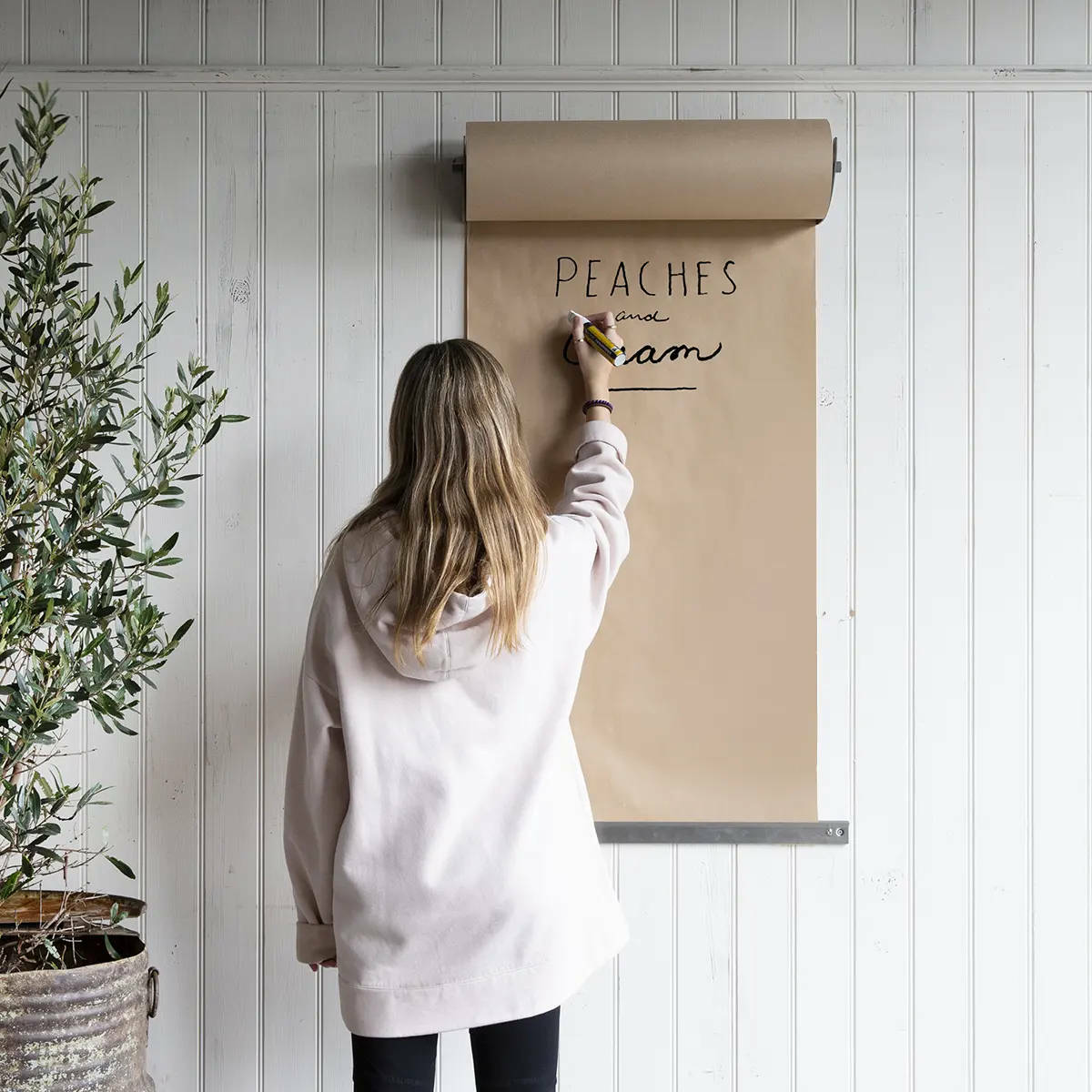
Just like floors, walls are prime locations to use adjacent or behind displays for messaging. This is especially useful in the case of a larger offering.
It’s often easier and more efficient to use wall signage to house one central menu with all your products and prices listed on it, rather than lots of small point of sale communications dotted around taking away the impact of your display.
A bakery for example may have room to show one whole cake but they could use a supportive wall sign or roller banner to list all the other varieties of cakes for sale.
When walls are used as tools for our counters, it gives us more capacity for display.
Magnetic Panels
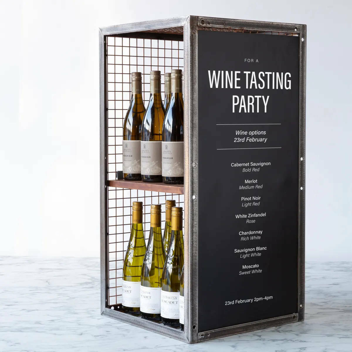
For a creative solution that won’t interfere with countertop displays, magnetic panels and strips are your best friend.Whilst these panels were designed for the BRIX Modular Retail Display range, they can be used anywhere you have metal retail furniture and stands.
The image below shows a small counter display of wine. The magnetic panel is secured to the side of the display allowing the counter display unit to be filled to capacity with wine, as intended.
A very creative way to make use of a small space.
